

Mary's Place website redesign

Mary's Place, established in 1999, is Seattle's leading shelter provider. It operates emergency shelters, mobile outreach and prevention services for homeless women and their families.
My Role
UX Designer/ Researcher
Year
2023
Duration
3 months
Deliverables
Tools
Stakeholder interviews
User surveys
Usability Test
Prototypes
Workshop
Design Review
Executive presentations
Hands off documentation
Figma
Google analytics
Canvas
Zoom
Miro,
OptimalWorkshop
Adobe Creative Suite
Team
Susan, M, Ray, L
Malcolm, G, Linda, M

Impact
-
Achieving a 55.52% reduction in outreach request time
-
35% increase in shelter contact information discoverability
-
Benefiting 48,000 users


Discover
PROBLEM
The website failed to represent the needs of its diverse audience .
The website was built in early 2017, and since then it has not been updated for 6 years. We are a much bigger organization now, the audience for the sites is changing. However, None of the groups are well represented.
GOALS
Redesign homepage and Help page for users to enhance information access.
ACTIVITIES AND OUTPUTS

KEY METRICS
6m25s
Average engagement time
60.42%
28k out of 48k users are returning users
80%
Users from the greater Seattle area.
64.1%
Female users across a mix age group from 25 - 65+
Hypothetical user groups
-
Shelter Guests
-
Donors
-
Volunteers
-
Future employees and Staff
Research
To verify hypothetical user groups and gather more first hand info , we conducted In-depth Interviews. I interviewed 10 participants, each 30 minutes. 10 interviewees from a mix of ages, genders, and ethnic groups includes volunteers, donors, guests, and staff.
PAINPOINTS
The current website is focused on return donors, but guests visit it to reach out for assistant or to make a request.

Not only guests feel lost on the website, outreach team members also had a hard time. The outreach team guides guests to complete requests for data collection, Currently, guests are not aware of this procedure, and the request feature remains hidden on the website.
ACTIVITIES AND OUTPUTS

Define Stage
Redefined User Groups
-
Donors/Volunteers,
-
Guests/Staff from outreach team
Defined User Needs
-
looking contact info
-
apply/ help guests submit request
-
request/ cancel monthly donate
-
check on event
Test Stage
As I have redefined users group, I conducted a usability test with the current website to define users' interacting behavior. I recruited 10 participants, each 30 minutes. We collected all the notes and used an affinity map to analyze and summarize the common patterns.
Usability test - Key findings
-
It took guest users an average of 3 mins to find a contact phone number.
-
Guests and staff could not find the outreach request, or it takes longer for them to find it.
-
First - time users do not rush to click on any CTAs. “ I'd like to know them a little before clicking on any CTA"
-
The success rate of making donate is 90%. “ It was easy to navigate. The process is pretty straight forward. “
ACTIVITIES AND OUTPUTS

Accessibility check - Key findings
Along with conducting usability test, I run a quick accessibility check by using Ace.com to define how the current websites is accessible for people with disabilities, and what we can improve.

ACTIVITIES AND OUTPUTS

Design Stage
Based on all the research and test results, we found that their donor flow is great, volunteer sign-up works well. However, the current landing pages almost build for people who know what MP is. It's not immediately clear what Mary's Place is to a first timer. And there is a large room to improve the experience for our guests' group.
HMW
How might we make homepage and help page more useful for shelter guests, especially first-time guests?
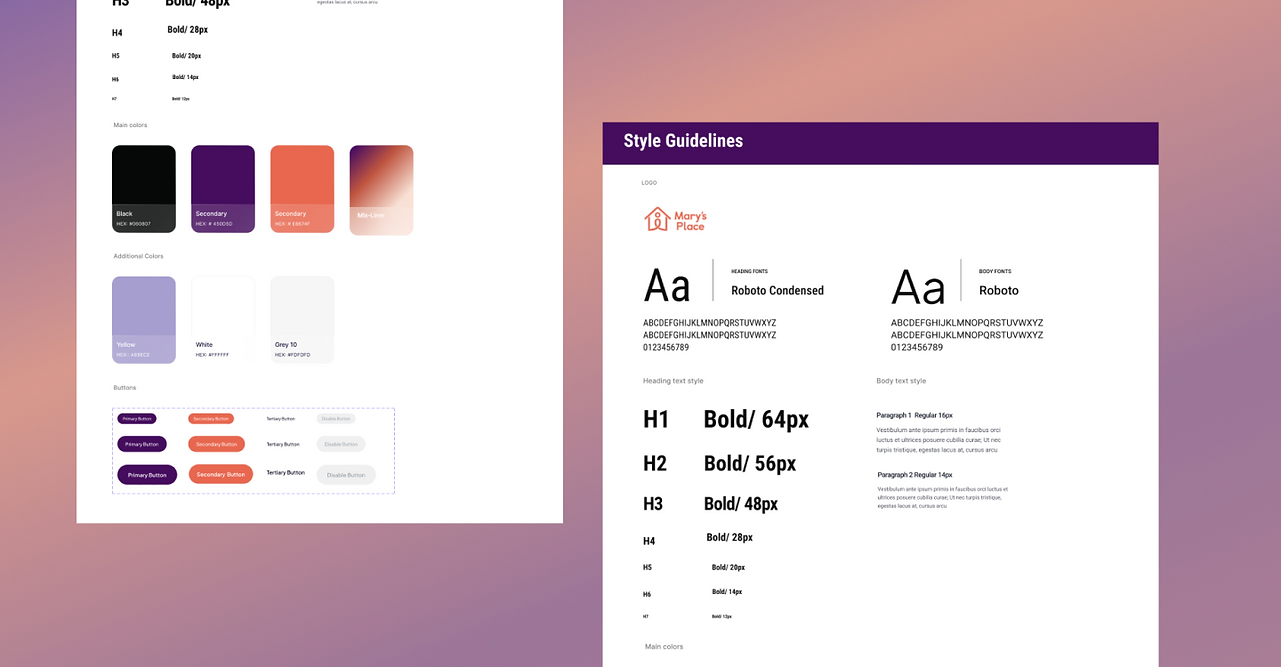
STYLE GUIDELINES
Reusable components helped us speed design process
Proposed Design Solution
Before
After
Key changes
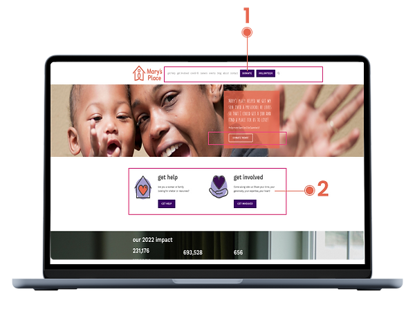
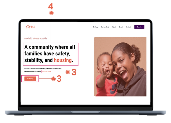
1 Remove one donate button by keeping the top one and delete the below one the banner image. Per feedback from users. 10/9 users They were confused why there are two same donate buttons one underneath another. Reducing the number of donate buttons on a website can increase donations over time.
2 Remove unnecessary CTAs, such as Get Involved button and Volunteer button. Volunteer button on the top and place it in a lower area instead. Their CTA buttons appear quite heavy. First-time volunteer users tend to explore rather than hastily clicking on any CTA buttons. Returning volunteers, on the other hand, go directly to the volunteer section via the navigation menu.
3 Prioritize Get help and finding shelter phone number, Guests most frequently visit the "Get help" section, and they urgently seek the phone number for finding shelter. Our interviews reveal that guests are in a state of urgency, attempting to call any visible number and clicking every button and link on the website to reach us through multiple avenues. It would greatly assist them if they could swiftly access the information and contact us directly, avoiding the need to frantically explore every website element.
4 Replace the banner text with our mission statement to ensure that newcomers immediately understand what Mary's Place offers.
Before

After

Key changes
1 Take out the background image and move it to the left side. That way, users can both see the image clear and see these valuable number clear.
Before
After

Key changes
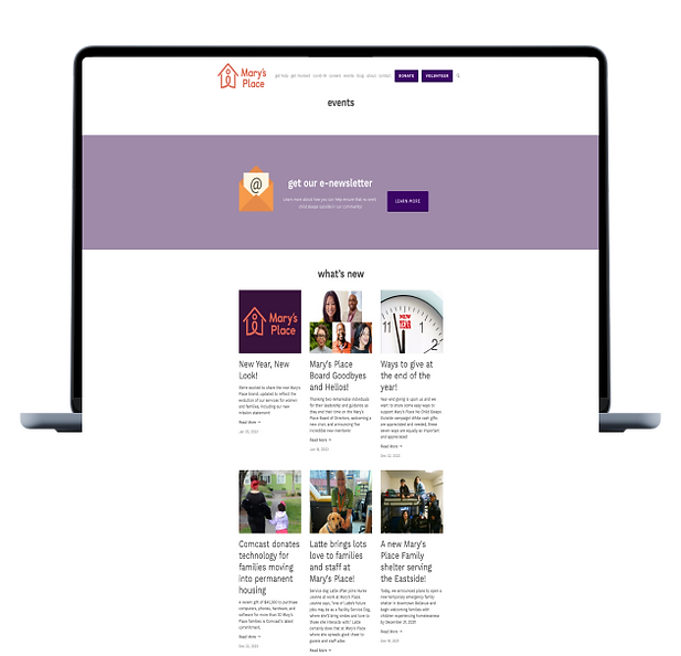
1 Add Event section on landing page. Per survey results, that’s the information regular visitors that look for, it worth a place on the landing page.
2 Add a Mission & Value section to ensure that visitors to the site understand what the company is all about without further click. It is a great way to build trust with them and can help potential donors to feel more confident in getting involved.
Before


After
Key changes
1 Moving the outreach request to the top. When guests land here, they are in a state of urgency, most of them wouldn't scroll down. However, the current position of outreach requests is hidden.
2 Making the phone number larger. It is the key information that users look for.
Achieved responsive design through Figma Auto-layout.
ACTIVITIES AND OUTPUTS


Conclusion
Challenge
Research stage
It was challenging to recruit participants from a shelter guest group for our research study..
Solution: Collaborate with the outreach team members, who were themselves guests, facilitated the recruitment process, fostering trust and comfort for sharing experiences.
Proposal stage
The fundraising manager has expressed concern that the new website may not be donor-centric enough.
Solution: Utilize donors feedback and research data to demonstrate that reducing donation buttons and content won't negatively impact the business.
Discover stage
Stakeholders requested certain tasks that were not in the scoop.
Solution: Explain why the stakeholder request falls outside it. Highlight how the new task might affect meeting deadlines. Revisit priorities together to align tasks with project goals.
Take-aways
A well-reasoned design solution requires the backbone of research metrics to effectively persuade stakeholders.
Gaining a transformative understanding the challenges that homeless individuals face
Engaging stakeholders in the process is a useful strategy to prevent misunderstandings.
Nest steps
-
Utilized the iterative design approach, involving testing and iterating to improve the website design
-
Collaborated in the development of the RFP (Request for Proposal) document.

