Information Architecture Case Study
Website Navigation Menu Design - Communication leadership (Commlead) Master’s Program
Project Overview

The Communication Leadership (Commlead) program at the University of Washington is a unique graduate degree where students, alumni, and faculty collaborate to create a variety of educational materials for clients and the public. In order to help people find relevant resources easier, I created and tested an Information Architecture and Interface Design for the navigation menu.
Project Details
My role:
Information Architect, UX Designer
Client:
Communication Leadership, School of Communications, University of Washington
Tools used:
Tasks I performed:
Figma, Miro, OptimalWorkshop, Excel, Adobe Creative Suite
Information Architecture, Comparative analysis, Content audit, Card sorting, Treejack testing, First-click testing, Wireframing, and Prototyping.
The Challenge
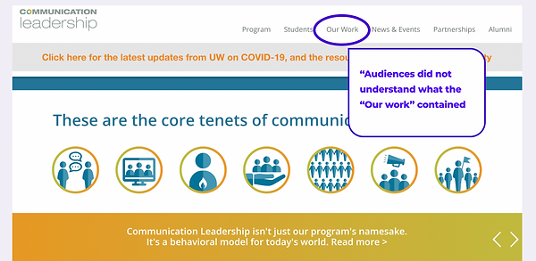
Through analytics review and user research, our team learned that the label and section called “Our work” on the current website was underperforming. Audiences were confused, did not understand what the “Our work” section contained, and why it would be useful to them, and so did not visit it.
Solution
To solve this user pain point, the client decided to create a new microsite to replace the “Our work” section. I was tasked with working on the information architecture including content organization, labels, and navigation menu. I used user research conducted by our team and worked collaboratively with our team lead to create an architecture for menu labels and organization and test it with users.

Impact
-
Offered a clear information architecture for future user interface (UI) designers and developers to follow
-
Balanced users’ voices and stakeholder’s needs
-
The user testing and study results on this microsite brought value to the whole team and impacted changes to labels and organization on the current site, as well providing an architecture for the future microsite.
Work Process

Business Goals
The new microsite will be a knowledge-base where people can learn skills, techniques, and get advice related to storytelling, design and communications. Making a user-friendly label and organization system is critical to its success.
We want the site to
-
Attract new users and help them to get to know us
-
Introduce people to concepts in Communication Leadership
-
Showcase our student and alumni’s knowledge to new audiences
Understanding Users
User Needs
Our audiences are primarily focused on professional skills development and looking for career advice. They want to see educational materials, learn hard and soft skills, and see previous work examples.
Because we want the site to work for people new to the Communications industry and unfamiliar with our program, it’s important that we use language that they understand and makes it easy for them to learn.
Information Architecture (IA) Process
Understanding the needs and expectations from both users and stakeholders, with plenty of preparation, I was ready to dive into the design process of creating information Architecture (IA).
Content Audit
Step 1:
Reviewed content item’s description and applied multiple descriptive tags for each content item.
Step 2:
Reviewed the tags for patterns, then grouped the content items with shared tags together.
Step 3:
Created categories for user testing

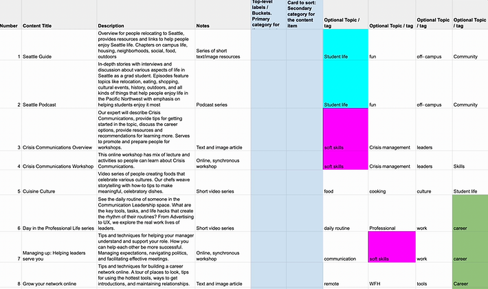
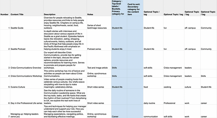
First draft of the possible main and sub categories, and these are the potential terms I chose to conduct the card sort activity with.
First Draft Categories
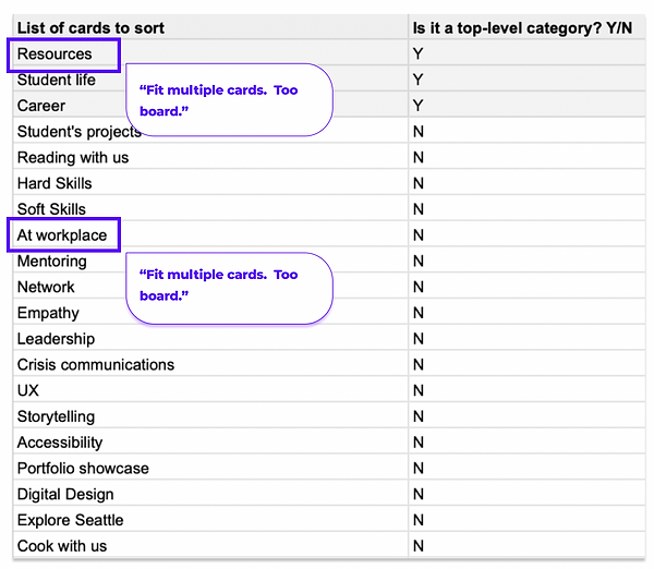
Lessons Learned - First draft categories
In the initial review, I learned that some of the categories might fit multiple cards. For example, “resources” might not work out because everything can be considered resource. Concepts like student life, tools, etc. can all be resources.
The term “at workplace” might not work out well, since a lot of the cards can fit into “at workplace”. So, I needed to revise some of the cards and choose more distinctive terms.
Labeling - Second Draft
Getting feedback from my team lead and colleagues, I made changes to my first draft of cards.
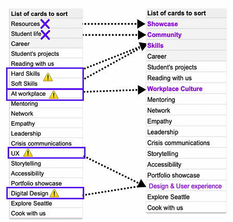
Change 1: Resources
Change 2: Community
Change 3: Skills
Removed “Resources”
Removed Resources, since it’s too broad and lots of subcategories can fit into it.
Changed “Student life” to “Community”
Since the main audiences for the site will not be current students, it was important to find a more accurate and inclusive term.
Grouped “Soft skills” and “Hard skills” into “Skills”
I first thought about creating a soft skills category and a hard skills category. Then, I decided to test that the term" Skills" includes both hard skills and soft skills, so I grouped them together.
Labeling - Second Draft
Getting feedback from my team lead and colleagues, I made changes to my first draft of cards.
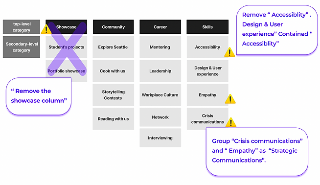
Lessons Learned- Second Draft
In looking at the term “Showcase”, it wasn’t clear from the label what the content would be. In reviewing the content items again, items in this category just didn’t seem to fit with the rest of the site.
I returned to the team lead and we decided that the content should not be in the microsite but remain part of the original website. This changed our project scope but created an elegant solution for the main site and new microsite.
It was helpful to realize this early in the process and avoid user testing and analysis of content that ultimately, wasn’t relevant to our project goals and audience needs.

Finalized Categories
With lots of consideration, I came up with these proposed cards which represent my categories and content groupings to test with users.
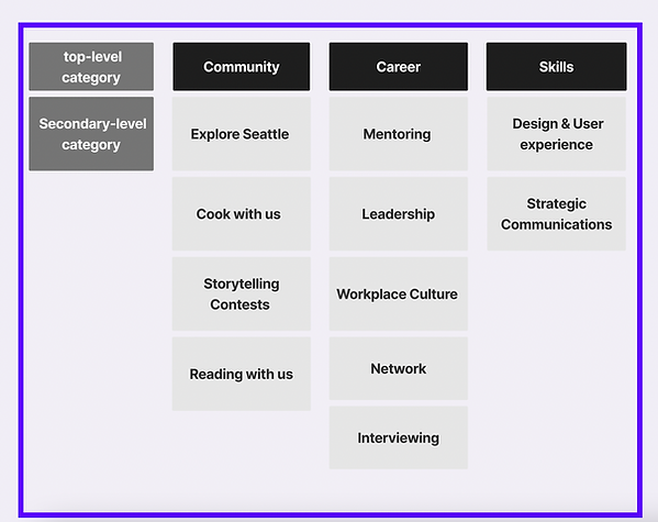
Card Sort
A card sort study aims to figure out what the user’s mental model is and how one would arrange the subcategories.

Methodology
To create the card sort, I used the Optimal Workshop tool and decided to do an unmoderated hybrid card sort. Because I wanted my participants to be able to add additional categories.
I also created the undecided category for participants. If they are uncertain about how to place a certain card, they can drag the card into the undecided group.

Card Sort Results
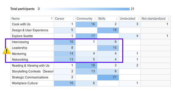
I conducted a card sort with 22 representative users recruited from across our audiences.
Key Findings
Key finding 1: People were pretty consistent with placing "Cooking With Us" (15 of 22 people ), "Exploring Seattle" (15 of 22), and "Reading & Viewing" (16 of 22) under the "Community” Section
Key finding 2: 16 out of 22 participants believed “Design & UX” is supposed to go under “Skills”, reflecting my initial assumption.
Key finding 3: I assumed the “Leadership” card would go under “Career”, however only 7 of 22 participants placed it into the “Career” section, and most participants placed “Leadership” under “Skills”.
Key finding 4: “Networking”, “Interviewing”, and “Mentoring” cards fell into both the “Skills” category and the “Career” category.
Focus for Future Testing
My Concerns
The results revealed that “Leadership”, “Networking”, “Interviewing” and “Mentoring” were unclear terms. Participants placed them into both the “Skills” and “Career” sections. To avoid this confusion, I considered grouping them together as “Skills & Career”.
If I group “Career” and “Skills” together, the menu would look like this:

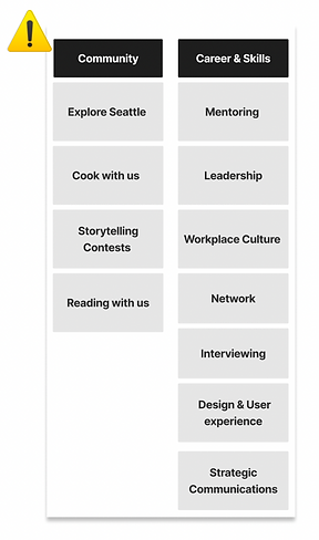
My concern is if I let the data results drive my menu, and group the “Skills” and “Career” together, it may match with the user’s preference. However, it would create too long a list of subcategories and hinder findability and browsing. Basically, too much content will live under that label and I have to break it up to make navigation easier for users.
While it helps to understand where users would place things and a little of their mental model around these terms, it wouldn’t necessarily be accurate to the content and would create design issues. Thus, I conducted further testing beyond a card sort.
Proposed Solution
In analyzing the card sort results, I found two areas for improvement.
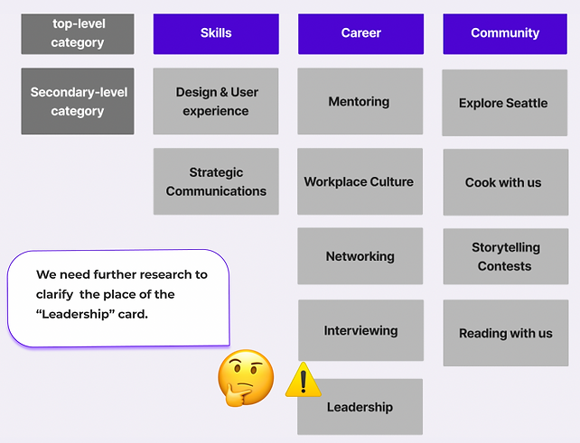
Key changes
Key finding 1: I decided to keep both the “Skills” and “ Careers” as the main categories, and kept the sub categories the same as the version we designed, except the “Leadership” card.
Even though the cards “Networking”, “Mentoring”, and “Workplace Culture” fell into both “Skills” and “Careers”, most people placed them in the “Career” path. Instead of grouping them together, I decided to keep them both because the categorization aligns with the majority of the user's needs.
Key finding 2: Only 7 of 22 participants placed the “Leadership” card into the “Career” section), and 14 of 22 participants placed “Leadership” under “Skills”. I would need further testing to clarify why participation see leadership as a skill and not a career topic
Tree-test study
I conducted a tree test to evaluate whether the menu would work or not. A tree test includes a hierarchy to showcase menu structure, and a series of task questions.
Prepare the Hierarchy
Prepared six task questions to test if certain parts of the proposed menu would work out. When writing the tasks, I made sure not to use the name of any of the labels in my tree to avoid exposing the answer.
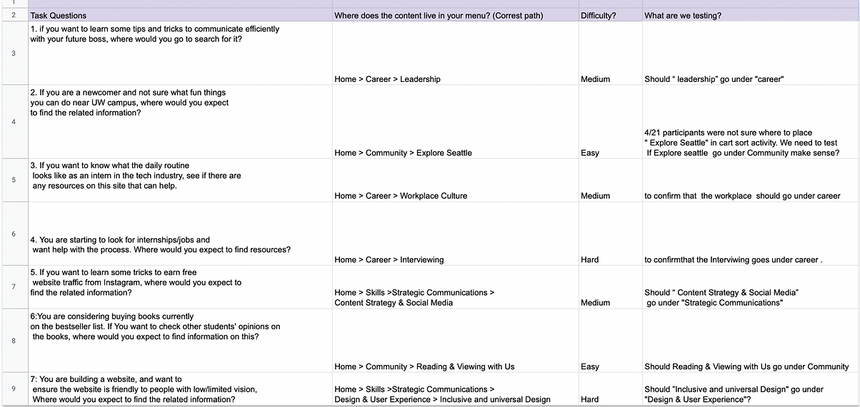
Tree Test Results
I conducted a study with 27 users representative of our audiences.
Key finding 1
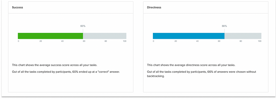
Out of all the tasks completed by participants, 60% ended up at a "correct" answer. At a 60% success rate, this tree test is technically successful.
Overall success rate.
.
Key finding 2:
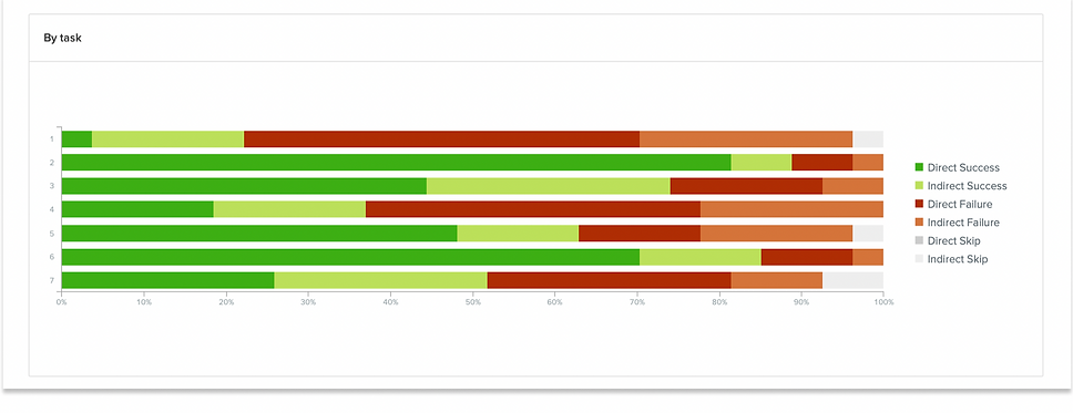
Success rate of each task. The color green indicates direct success, people chose that answer directly. Light green stands for indirect success, which means people go to other paths first Aligning with my assumptions, people are pretty consistent on task 2 and task 6,two easy-level tasks. For task 5, a middle-level task, 70% of the audience ended up with a "correct" answer.
Key Finding 3:
Task 7 was a challenging question. Surprisingly, the success rate was 53%, which showed that “Inclusive and Universal Design” under “Design & User Experience” works for more people than I expected. The rate of directness was high which means people were confident that “Design & User Experience” were supposed to go to the “Skills” path.

Investigate Problematic Tasks
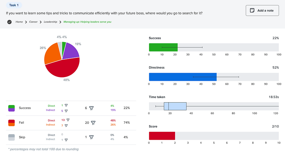
However, the results showed Task 1 and Task 4 are two major concerns. The success rate on Task 1 was 18%, and task 4 was 38%. To figure out what made task 1 and task 4 fail, we dug into their pietree to investigate. To figure out what made task 1 and task 4 fail, I dug into their pietrees, a visualization tool that shows you users’ chosen paths.
Key Finding 4:
The task 1 pie tree showed an interesting pattern. 74% of people failed, (48% direct failure), and participants clicked on the “Skill” path 26 times. This confirmed that moving “Leadership” under the “Skills'' section would be a solution.
Key Finding 4:
For task 4, I realized the question we asked was misleading. The data shows people believed it fit any of the subcategories under “Career”. “Looking for internships/jobs” can fall into “Interviewing”, “Workplace Culture”, and “Mentoring”. In this case, I removed these results from the study.


Finalizing the Solution
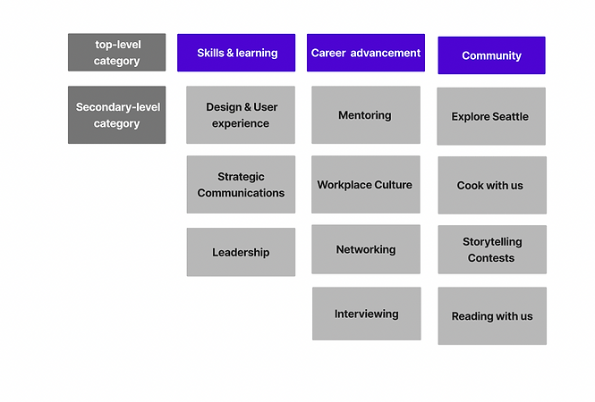
To try to make the IA design as inclusive as possible, to relabel “Skills” to “Skills & Learning” and “Career” to“Career Advancement” to make these two categories easier to distinguish.
The feedback from user testing showed me enough of the users’ mental models to understand how they arrange concepts and where I needed to provide more clarity to simple labels to better demonstrate the type of content that lives under that label.
Proposed Information architecture (IA)
Gathering all the findings from the card sort first, then the tree test, I was confident about sharing the finalized menu tree.
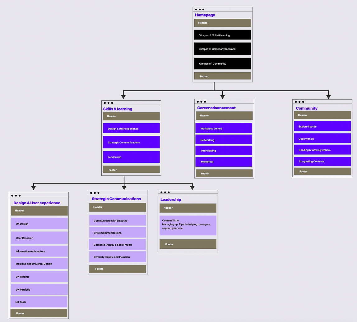
To make the menu structure easier to visualize, I sketched it into a Site Map.
Wireframe
Following the sitemap, I sketched the menu wireframe on Figma.


Prototype
I created the prototype to show the key flows. Feel free to check it on Figma.
Figma Link : :Commleadmirco-sitemenu
What’s Next?
-
Conducting a one click user testing to finalize the labels, groupsing, and order.
-
Revising the menu design based on the testing results.
-
Presenting the new menu design to stakeholders.
-
Handing my work off to the UI designer to work on the full website design.
Take-aways
-
Keep it iterative
-
Test with users
-
Match your content
What I learned from creating a user-tested Information Architecture.
Although IA is only one of the User Experience Design steps, it can go really deep and contains many research steps. Designers need to remind ourselves, designing IA is also an iterative process. Look for areas to test your labels instead of trying to find the perfect labels first.
The card sorting can help to understand the user's mental model, but has its limitations when it comes to complex menu design. We should not simply make changes to our menus based on a card sort study result. Instead, use it to help you see how users interact with your concepts, not as a final menu result.
It takes a lot of work and consideration to prepare the “best” labels for cards to sort. Content audits can be chaotic at the beginning, but it’s crucial for creating the labels that can accurately represent the content. If a card label does not match the content, the card sort study will be a huge fail.

